BlueSky Design System
Bell, 2023
help
Guiding question
How might we reduce design decisions and build quality products faster?
assignment
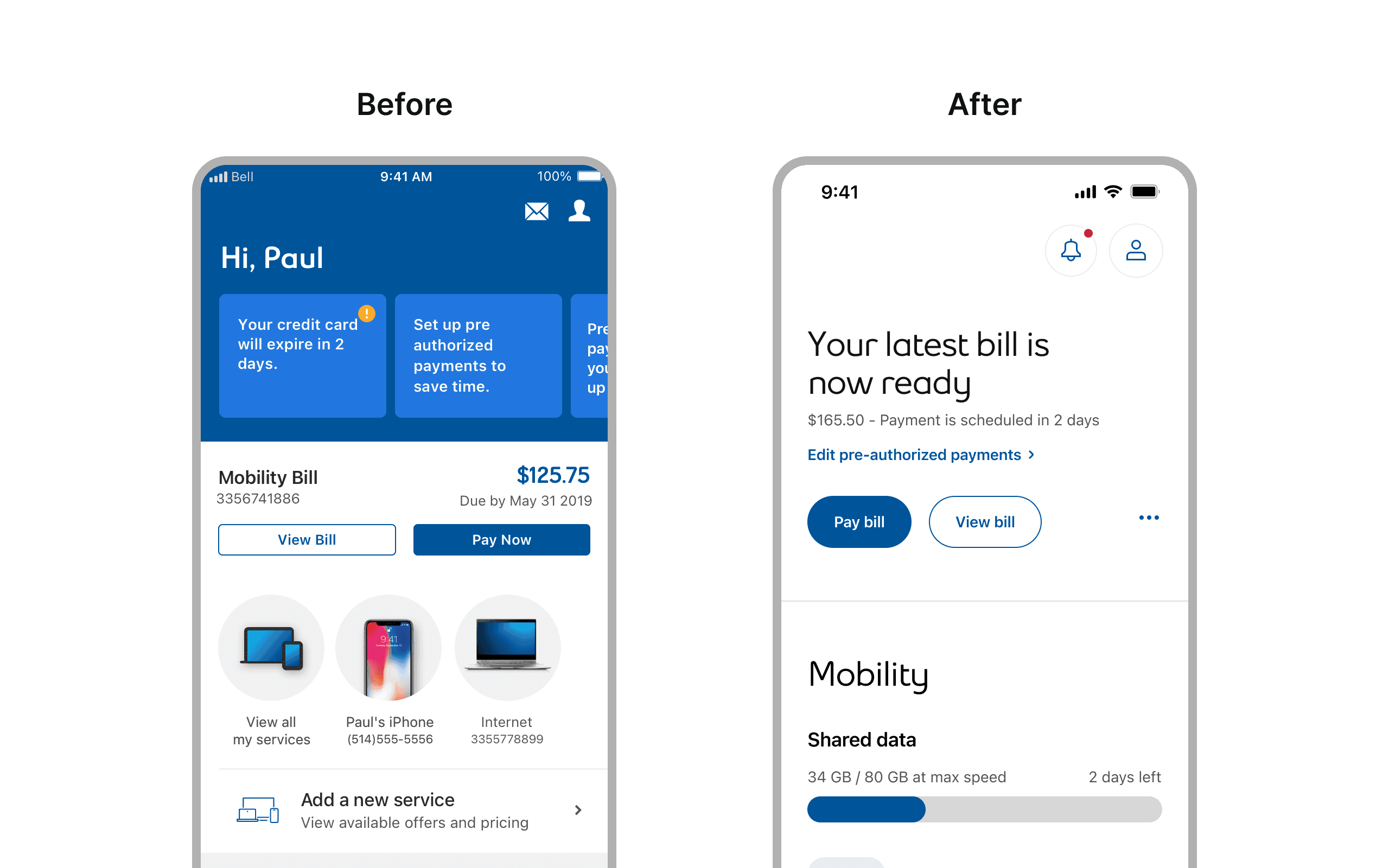
Define · Context
Bell was getting a new look and needed a system to support it.
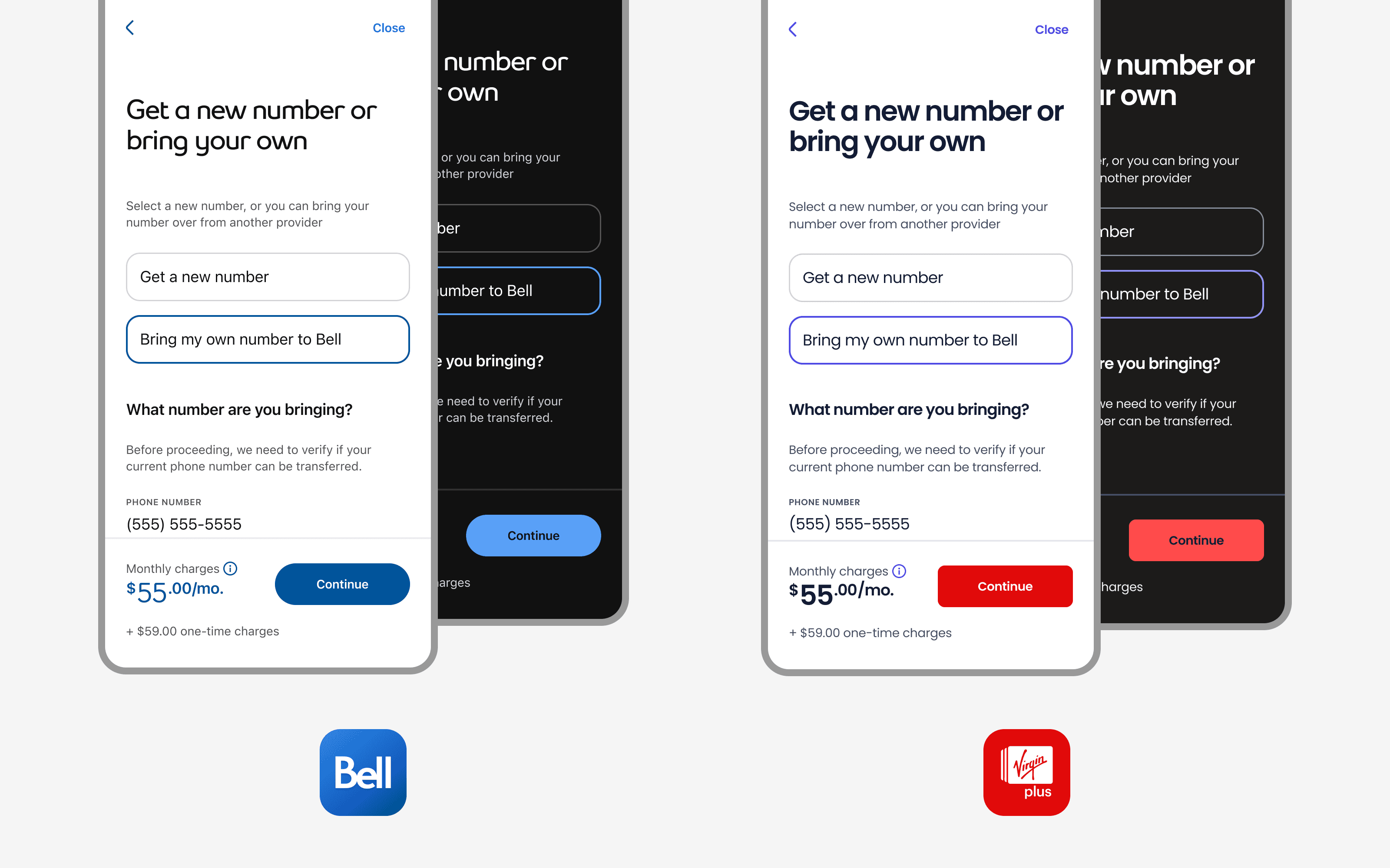
The MyBell app was undergoing a full redesign. Pushing towards a more modern, airy UI with improved usability. The Virgin Mobile app would follow. Both apps shared largely the same UX, which made the opportunity clear: rather than designing and building each experience separately, we could build one system that supported both brands.
But before we could do that, we needed a foundation. No shared component library. No token structure. No documentation process. We were starting from the ground up.
route
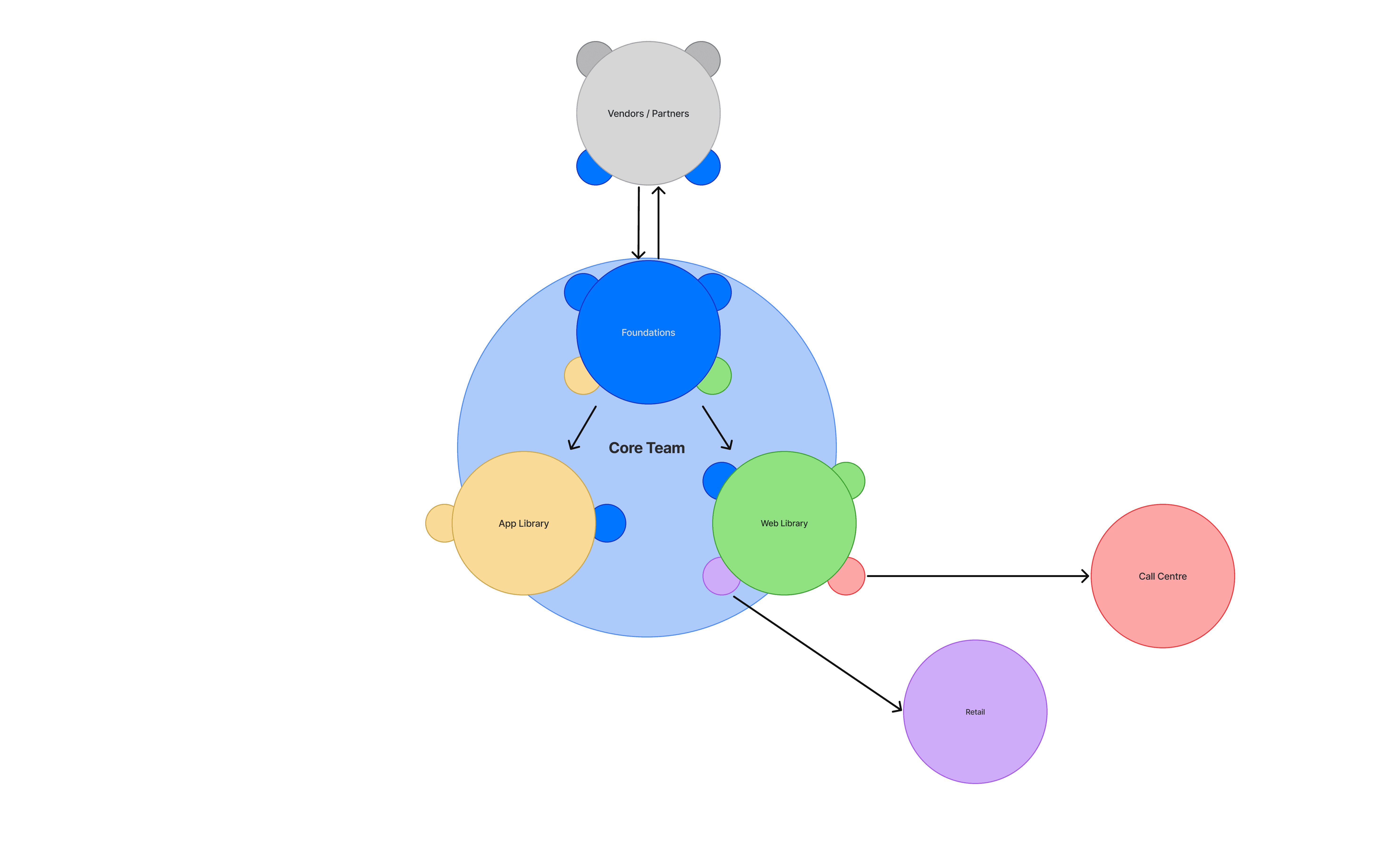
The process
One process, from first token to two brands
BlueSky grew through four stages. Every section below maps back to one of them, so you can follow how the system was defined, built, adopted, and kept evolving.
flag
Define
Frame the goals, principles, and architecture a multi-brand system needs before anything gets built
build
Create
Turn those decisions into tokens, icons, and components — built once, flexing across two brands
rocket_launch
Adopt
Give designers and developers clear intake, quality bars, and handoff so the system actually gets used
auto_graph
Evolve
Use feedback and real usage to prioritize updates — and grow the system from app to web
wb_sunny
Highlights
One system, two brands, endless possibilities.
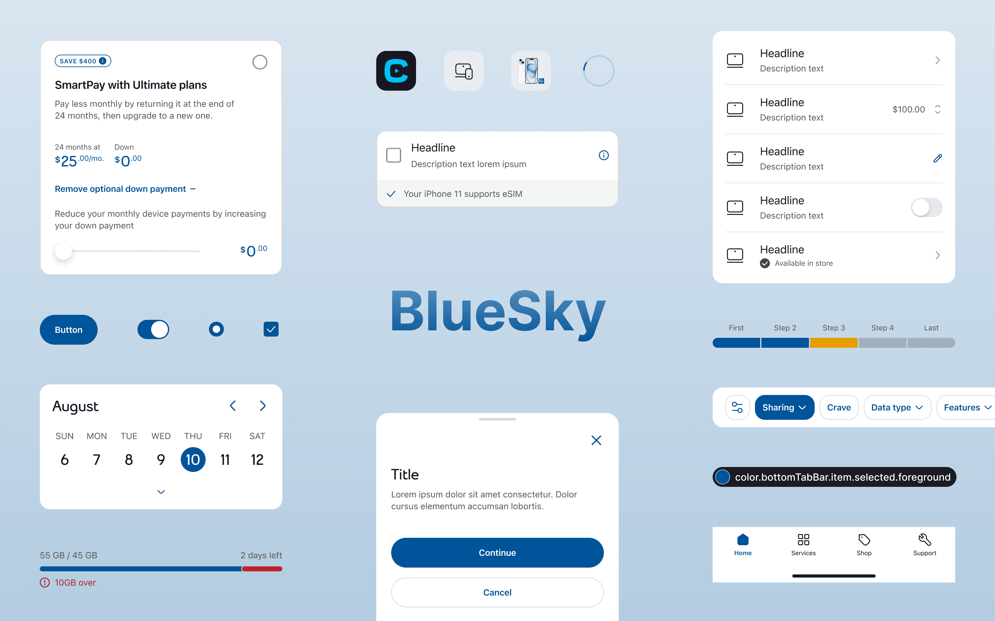
token
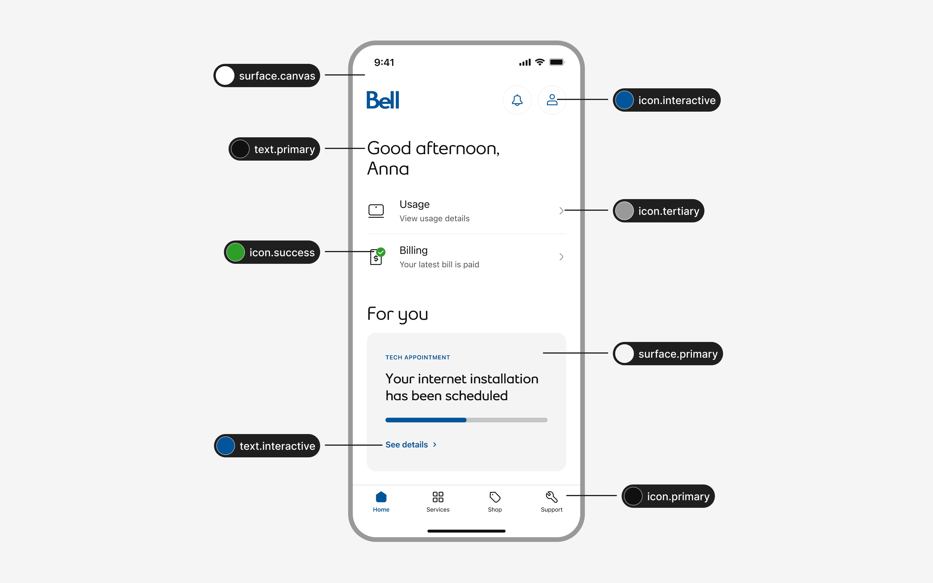
Create · Tokens
A token structure built to flex without breaking
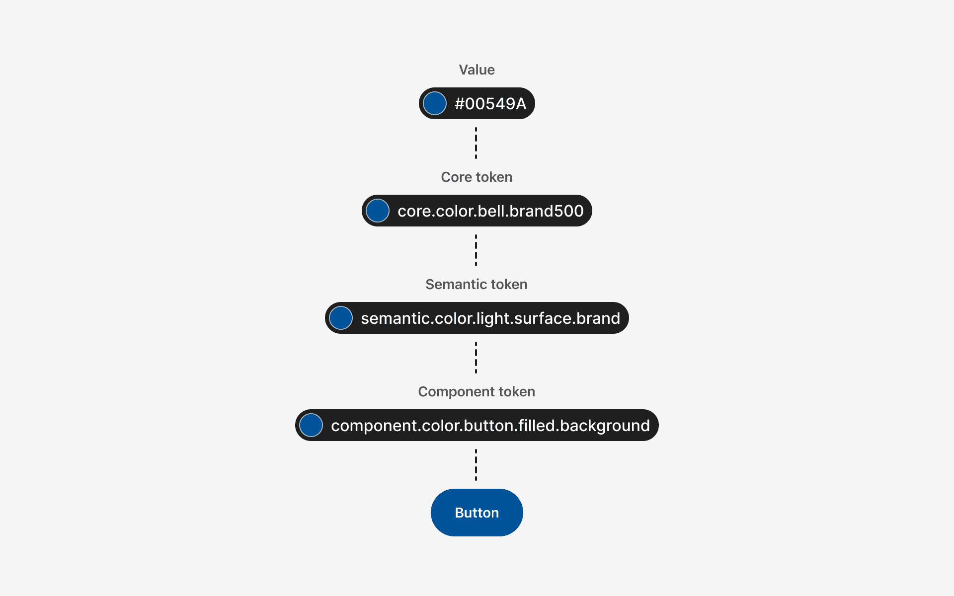
Tokens were the backbone of everything BlueSky could do — multi-brand support, light and dark themes, platform differences, and breakpoints all lived here. The challenge wasn't just building a token structure, it was building one that could scale as the system grew without becoming impossible to maintain.
We organized our tokens into distinct layers, each with a clear responsibility.
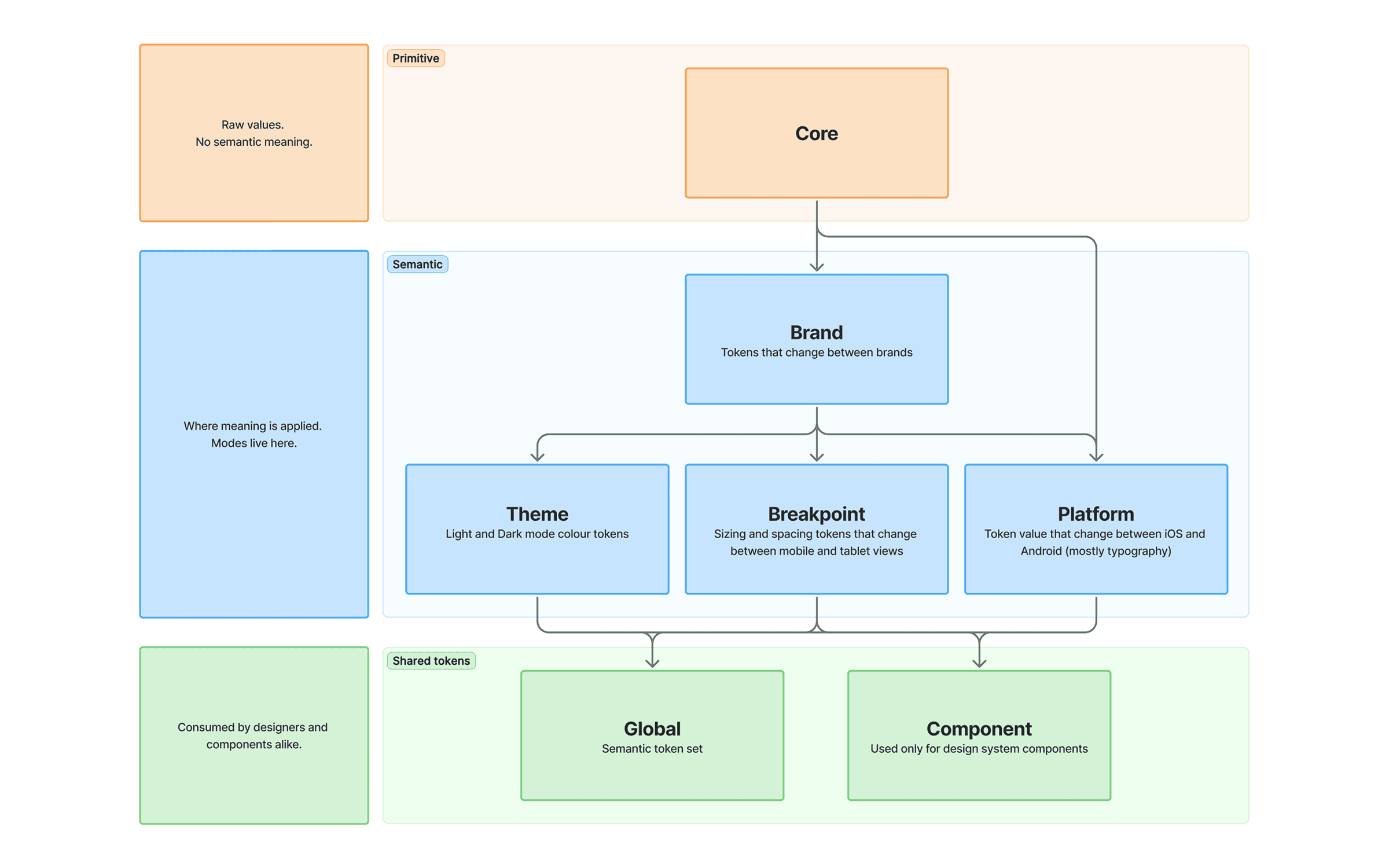
token
Core
unfold_more
brand_family
Brand
unfold_more
ios
Platform
unfold_more
responsive_layout
Breakpoint
unfold_more
contrast
Theme
unfold_more
widgets
Component
unfold_more
globe
Global
unfold_more
Tooling
We started with Token Studio before Figma Variables existed.
When Variables launched, we upgraded to the pro version which let us sync our tokens directly with Figma Variables — giving designers the ability to switch between brands, themes, platforms and breakpoints right in their files. Devs benefited too, inspecting designs and seeing variable names that matched our token names 1:1.
From Token Studio, our tokens were exported to GitLab and transformed for iOS (SwiftUI) and Android (Jetpack Compose).

Designers needed guidance for spacing as much as colour
We also created semantic spacing tokens to reduce guesswork around common layout patterns.
Our spacing scale was built on a 4px base — spacing.x1 = 4px, spacing.x2 = 8px, and so on. This gave designers a consistent set of values to work from, and semantic tokens like spacing.semantic.vertical.betweenFields mapped directly to that scale for specific use cases.
Without them, designers were making independent spacing decisions for the same patterns. A dedicated token meant everyone was working from the same value, every time.

lightbulb
Key takeaways
Component tokens for everything bloated our token file fast. Use them sparingly, only for values that genuinely vary between brands and themes. Semantic tokens handle the rest.
Naming inconsistencies are easy to miss early and painful to fix later. By the time we caught ours, other teams were already consuming those tokens, turning a cleanup into a breaking change.
Once other teams are consuming your tokens, changes become a product decision. Deprecations need communication, migration guides, and lead time, not just an internal update.
grid_guides
Create · Iconography
Giving designers the tools to grow the icon library
As the app evolved, so did our need for new icons. Rather than bottlenecking all icon creation through the design system team, we established clear guidelines so other designers could contribute while keeping the library consistent.
Guidelines covered key shapes, grid structure, stroke width, vector construction, and stroke end treatment, everything needed to create icons that felt like they belonged together.


flowchart
Adopt · Intake
Filtering and prioritizing updates to the system
Requests for new components and updates came in from all directions, each with their own sense of urgency. Without a clear process, it was hard to prioritize and even harder to manage expectations across feature teams.
We built a repeatable intake process to fix that. Design, our product owner, and dev worked collaboratively to assess and prioritize requests, making sure the most impactful work always moved first.


brick
Adopt · Components
Setting the bar for what gets built
Not every component request made it into the system. Each one had to earn its place by passing five criteria, then be prioritized based on urgency and demand.
cycle
Reusability:
Can the component be used across multiple features and brands?
Are there any existing components or patterns we can use?
format_shapes
Consistency: Does it align with the rest of the design system and visual style?
code_blocks
Complexity:
Is it simple to build in dev?
Is it easy to maintain in design?
accessibility_new
Accessibility:
Does it meet accessibility standards for all users?
If interactive, does it have a big enough touch target?

Leveraging native components when it made sense
Our design system was built to support two primary users: designers and developers. Their feedback was critical to evolving the system and ensuring it met their needs.
docs
Adopt · Documentation
Sweating the details for a smooth handoff
All of the work we had done up to this point was meaningless if we didn’t have a detailed documentation to handoff to engineers.
This documentation served as a vital resource for both design and development, ensuring smooth handoffs and adherence to the system’s standards.
Each component doc included:
Anatomy: elements, what is optional, what is configurable
Variants & states: configurations and interaction states
Specs: spacing, sizing, typography, color, plus a token table (most-used by engineering)
Behaviors: interaction rules and touch targets
Guidelines: do’s and don’ts, usage context
Accessibility: screen reader guidance, focus order, keyboard behavior


fast_forward
Evolve · Impact & Next steps
A unified experience across app and web
We've seen the impact of BlueSky on our mobile apps, and it got stakeholders thinking bigger. A consistent experience across Bell and Virgin Mobile, less duplicate work between brands, and smoother handoffs between design and dev all pointed to what a well-built system could do.
Bell's web products were next. Inconsistent, disconnected from the app, and overdue for a refresh, the web was the next challenge. The other BlueSky lead and I were asked to help kick off that initiative, bringing everything we'd learned to a much larger surface.
That work is ongoing. But it started here.